Free shipping on orders over $100

The Science of Color: How Different Colors Influence Mood and Human Emotion
7/9/20264 min read
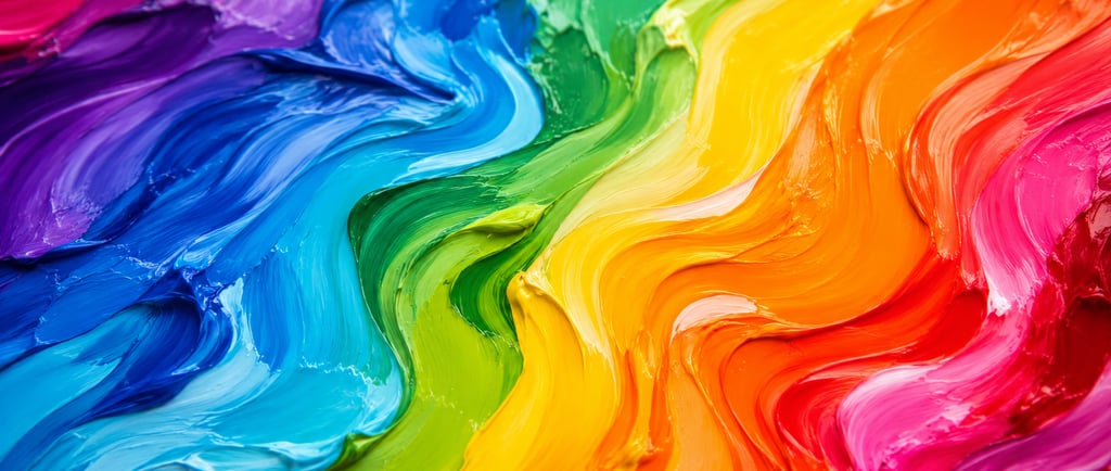
Why Do Colors Affect Our Mood?
Have you ever noticed how a blue ocean can make you feel calm, a golden sunset can evoke warmth, or a lush green forest instantly feels refreshing? While color preferences vary from person to person, scientists have spent decades studying how different colors influence the human brain, emotions, and behavior.
The science behind how colors influence mood combines neuroscience, psychology, biology, visual perception, and environmental science. Although no single color creates exactly the same emotional response in every individual, research consistently shows that color plays a significant role in how we experience the world around us.
From the clothes we wear to the spaces we design and the products we choose, color quietly shapes our daily experiences.
How the Human Eye Detects Color
To understand why colors affect mood, it helps to understand how humans actually perceive color.
Light travels in waves, and each visible color represents a different wavelength on the electromagnetic spectrum.
When light reflects off an object, only certain wavelengths reach our eyes.
Inside the retina are specialized photoreceptor cells called cones.
Humans typically have three types of cones:
Short-wavelength cones (S-cones) detect blue light.
Medium-wavelength cones (M-cones) detect green light.
Long-wavelength cones (L-cones) detect red light.
These cones convert light into electrical signals that travel through the optic nerve to the brain's visual cortex.
The brain then reconstructs these signals into the rich spectrum of colors we experience every day.
Color, therefore, isn't actually contained within an object—it is created by the interaction between light, the eye, and the brain.
The Psychology of Color
One of the most studied areas of cognitive psychology is color psychology.
Although cultural experiences and personal memories influence individual preferences, researchers have identified several emotional patterns that appear consistently across many populations.
These associations are not absolute rules, but they help explain why certain environments often produce similar emotional responses.
Blue: Calm, Stability, and Trust
Blue is one of the most consistently preferred colors worldwide.
Researchers suggest blue often promotes feelings of:
Calmness
Reliability
Stability
Peacefulness
Reflection
One explanation comes from evolution.
For most of human history, blue represented positive natural resources:
Clear skies
Clean water
Calm oceans
These environments generally indicated safety and survival.
Modern studies have also shown that blue environments may encourage concentration and reduce feelings of stress in certain settings.
Green: Nature, Balance, and Restoration
Green occupies the center of the visible light spectrum, making it especially comfortable for the human eye to process.
Because green dominates forests, fields, and healthy vegetation, the brain frequently associates it with:
Growth
Renewal
Balance
Restoration
Well-being
Environmental psychologists have found that spending time in green spaces can help reduce mental fatigue and improve attention.
This phenomenon is known as Attention Restoration Theory, which suggests that natural environments allow the brain to recover from prolonged cognitive effort.
Warm Colors: Energy and Excitement
Colors such as:
Red
Orange
Yellow
contain longer wavelengths that naturally attract human attention.
These colors are often associated with:
Energy
Passion
Warmth
Optimism
Activity
From an evolutionary perspective, warm colors frequently signaled important environmental information such as fire, ripe fruit, or sunlight.
Because of their visibility, warm colors continue to play an important role in advertising, branding, and product design.
The Neuroscience Behind Color Perception
Color influences far more than simple visual preference.
Research suggests that colors can affect activity within several regions of the brain responsible for:
Memory
Attention
Emotional processing
Decision-making
Although scientists continue to study the exact neurological mechanisms, color appears capable of subtly influencing how efficiently the brain processes information.
For example:
Cool colors may encourage longer visual attention.
Warm colors often stimulate faster reactions.
Soft natural color palettes generally produce lower levels of visual fatigue than highly saturated environments.
Why Nature Uses Color So Effectively
Nature offers some of the best examples of harmonious color combinations.
Ocean water shifts between:
Deep navy
Turquoise
Soft blue
Emerald green
depending on sunlight, depth, and mineral composition.
Similarly, forests display countless shades of green that change throughout the seasons.
These naturally occurring color gradients provide constant visual variation without overwhelming the brain.
Scientists believe repeated exposure to these environments throughout human evolution helped shape many of our modern color preferences.
This may explain why natural landscapes consistently rank among the world's most visually appealing environments.
Color in Design and Everyday Life
Modern designers understand that color influences first impressions.
Whether designing architecture, artwork, websites, or carefully crafted products, color helps communicate emotion before a person even begins reading.
Research has shown that people often form impressions within seconds.
During that brief moment, color contributes significantly to perceptions of:
Quality
Sophistication
Cleanliness
Comfort
Trustworthiness
Rather than relying on bold colors alone, many premium brands intentionally use balanced palettes inspired by nature.
Soft blues, natural greens, warm neutrals, and gentle earth tones often create a timeless, calming experience.
Color, Materials, and Craftsmanship
Color becomes even more fascinating when combined with carefully selected materials.
Unlike opaque materials, borosilicate glass interacts with light in unique ways.
Its exceptional clarity allows surrounding colors to pass through, reflect, and refract, creating constantly changing visual experiences depending on the environment.
Sunlight filtering through clear glass, ocean reflections dancing across smooth surfaces, or soft natural lighting can all transform how color is perceived.
This interaction between light, material, and color demonstrates why thoughtful craftsmanship extends far beyond appearance alone.
If you're interested in learning more, explore our educational article on How Borosilicate Glass Is Made, where we explain the fascinating science behind one of the world's most durable specialty glasses.
You may also enjoy reading Why Humans Are Naturally Attracted to Curved Shapes, where we explore how neuroscience influences our perception of beautiful design.
The Science Behind Beautiful Color
Color is much more than decoration.
It represents the remarkable collaboration between physics, biology, psychology, and neuroscience.
Every color we experience begins as light, becomes electrical signals inside the eye, and is ultimately interpreted by one of the most sophisticated organs on Earth—the human brain.
Understanding how different colors influence mood reminds us that beauty isn't accidental.
It is shaped by millions of years of evolution, the remarkable complexity of human perception, and the natural world that continues to inspire thoughtful design.
At Pink BlueJay, we're passionate about exploring the science behind materials, craftsmanship, and beautiful design. Through educational content, we hope to inspire curiosity about the fascinating relationship between nature, science, and the objects that surround us every day.
© 2025. All rights reserved.
Discover premium adult pleasure products from Vancouver Island.